


Safety signage is the set of standardised signs, symbols and colours that warn people about hazards, tell them what they must or must not do, and show them the way to safety. Every workplace, restaurant, warehouse or public venue benefits from it, and many are legally required to display it. The right sign, in the right place, in the right colour, can prevent an injury or speed up an evacuation.
This guide covers the five sign categories, the rules behind them, how to place signs so they are noticed in time, and how to keep them effective for years. It is written for South African businesses that need signs for premises, vehicles or events.
What Safety Signage Is and Why It Matters
Safety signage communicates a specific risk or instruction through a combination of shape, colour and pictogram, so that it can be understood quickly, often without reading a word. That speed is the point. A visitor who does not speak the local language, a new employee on day one and a contractor in a hurry should all grasp the message in seconds.
Good signs do three jobs:
- Warn people about hazards they may not have noticed, such as wet floors, overhead cranes or live electrical equipment.
- Instruct people on required behaviour, such as wearing protective equipment or keeping a door closed.
- Guide people during an emergency, showing exits, assembly points and the location of fire-fighting equipment.
Signage does not replace proper risk control. Guards, training and safe systems of work come first. What signs do is cover the residual risk that remains after those controls are in place. The UK Health and Safety Executive makes the same point, advising that signs should be placed early enough for people to see and understand them and take risk-reducing action before reaching the hazard, and that they should be clear, noticeable, clean and maintained.
The Five Types of Safety Signs
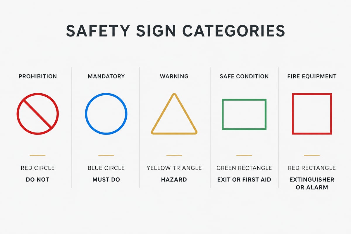
There are five main categories of safety sign, each identified by a distinct combination of shape and colour. Learning these lets you choose the correct sign every time and recognise a non-compliant one at a glance.
Prohibition signs
Prohibition signs forbid a behaviour. They use a red circle with a diagonal bar over a black pictogram on a white background. Typical examples are no smoking, no naked flames, no entry for unauthorised persons and do not use a mobile phone. For a bar or restaurant, a no smoking sign near a gas bottle store or a kitchen is a sensible precaution.
Mandatory signs
Mandatory signs state an action that must be taken. They use a white pictogram on a blue circle. Typical examples include eye protection, hearing protection, safety footwear and hard hats. These belong at the entrance to the area where the requirement applies, so the instruction is seen before the person is exposed.
Warning signs
Warning signs identify a hazard. They use a black pictogram inside a yellow triangle with a black border. Common examples include slippery surfaces, forklift traffic, overhead loads, electricity and hot surfaces. OSHA specifies yellow backgrounds for caution signs, with concise, easy to understand and factually accurate wording on the sign.
Safe condition and escape signs
These signs point to safety rather than away from danger. They use a white pictogram on a green rectangle or square. Fire exits, first aid stations, emergency eyewash points, assembly areas and escape routes all fall under this heading.
Fire equipment signs
Fire safety signs use a white pictogram on a red rectangle. They show where extinguishers, hose reels, fire alarm call points and fire blankets are located. They should be visible from any direction of approach and mounted so that furniture, stock or open doors cannot obscure them.
| Category | Shape and colour | Meaning | Example |
|---|---|---|---|
| Prohibition | Red circle with diagonal bar | Do not | No smoking |
| Mandatory | Blue circle | You must | Wear eye protection |
| Warning | Yellow triangle | Hazard present | Wet floor |
| Safe condition | Green rectangle | Safe route or aid | Fire exit |
| Fire equipment | Red rectangle | Location of fire kit | Fire extinguisher |
Rules and Standards That Shape Safety Signage
Safety signage in South Africa is shaped mainly by the Occupational Health and Safety Act and by national and international standards that define sign shapes, colours and symbols. Rather than quote clause numbers from memory, confirm current requirements for your premises with your safety officer or local fire department, since the applicable rules depend on the type of building and the activity inside it.
Many pictograms in use worldwide come from ISO 7010, an international standard for graphical safety symbols covering hazards, fire protection and evacuation. An overview of ISO 7010 on the ANSI standards store describes how these registered signs are used. A related standard gives guidance on building a coordinated safety-signing system, which is useful when a site needs consistent signs across several buildings.
International regulators show how specific the rules can be. OSHA's accident-prevention sign standard applies to signs used to identify hazards where failure to mark them could lead to injury or property damage, and new and replacement signs must follow the standard. Its exit-route rules require that exit signs be legible, with "Exit" letters at least 6 inches (15.2 cm) high. Your own obligations may differ, but this figure is a useful benchmark when deciding how large an emergency sign should be.
One practical consequence is worth acting on. If you have inherited a mix of old, hand-made or faded signs, treat that as a prompt to review the entire set rather than patching gaps one sign at a time.
Where to Place Safety Signs
Safety signs should be placed where a person will see them early enough to act, at a height and angle that makes them readable, and without anything blocking the line of sight. Placement decides whether a correctly designed sign actually works.
Placement principles
- Place the sign before the hazard, not at it. A person standing next to a wet patch has already passed the point of useful warning. Allow enough distance for someone to read, understand and react.
- Mount at eye level for pedestrians. Mounting height should suit the people who will read the sign, usually around eye level for pedestrians. Place signs higher where stock, vehicles or crowds would hide them.
- Keep the sight line clear. Check from every approach direction, including doorways, corners and the far end of a corridor.
- Light them properly. A sign that cannot be read in the dark is useless during a power failure, so emergency signs may need illumination or photoluminescent material.
- Group related messages. Several instructions for the same entrance, such as hard hat, safety boots and eye protection, are easier to absorb on one combined board.
Placing emergency and escape signs
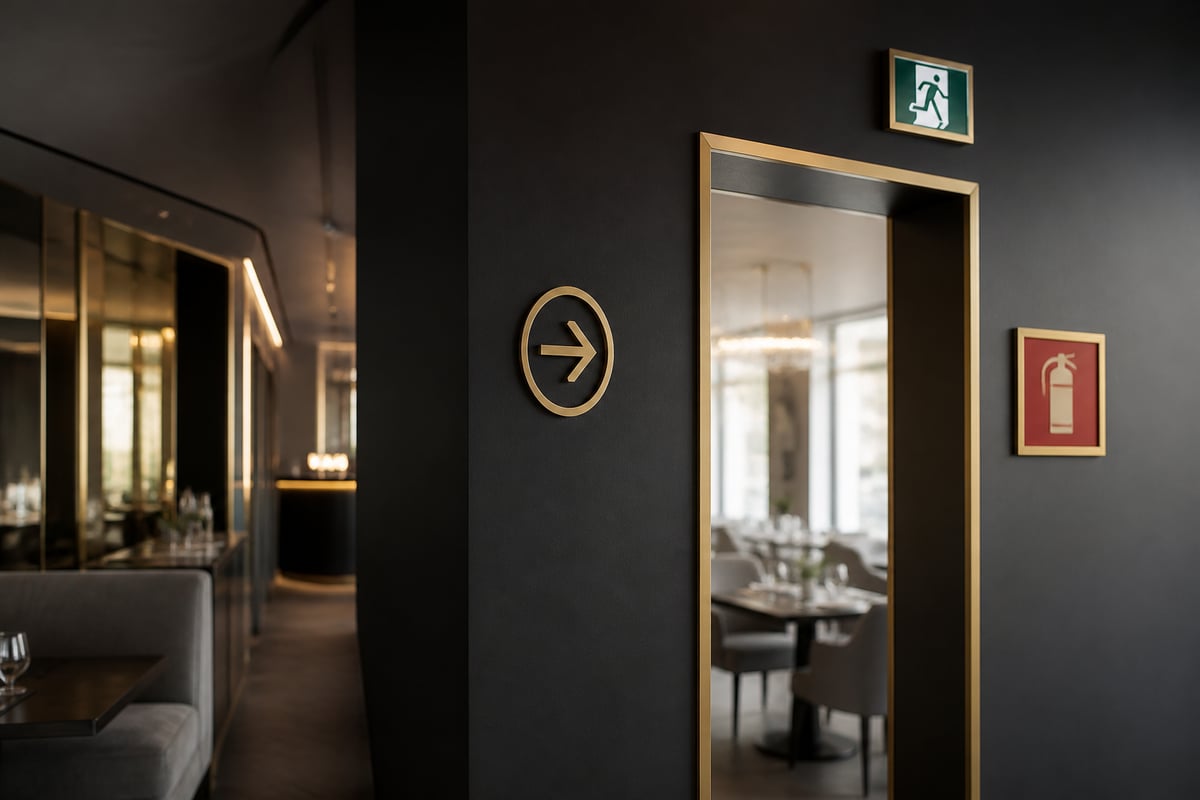
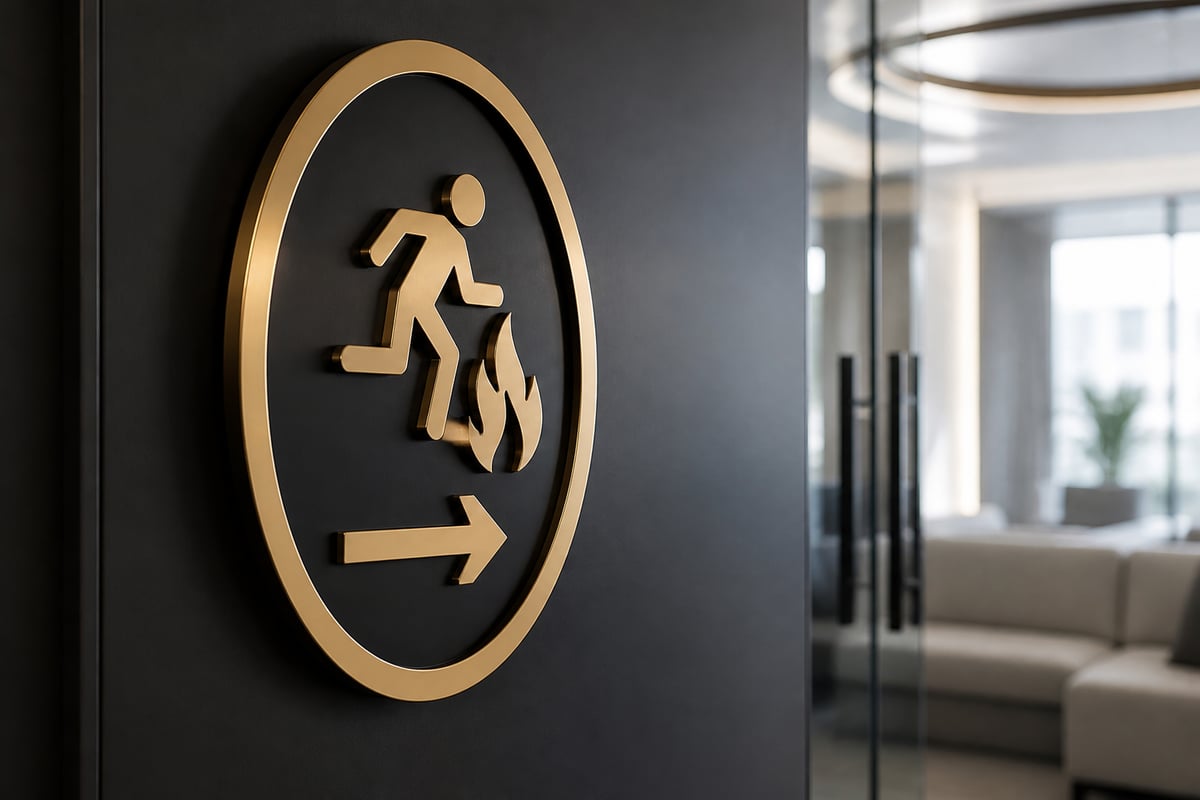
Exit signage deserves particular care. OSHA requires that where the route to an exit is not immediately apparent, directional signs be provided along the exit access, with the line of sight to an exit sign clearly visible at all times. Evacuation guidance also covers how exit routes should be lit and marked, and how to mark doorways that could be mistaken for exits, such as store rooms and cellars. For a restaurant or bar with a dim, atmospheric interior, this matters. Decorative lighting, drapes and neon features can easily compete with or hide an exit sign, so the escape signage must be planned alongside the decor, not after it.
Matching the Sign to the Setting
The correct material, size and finish depend on where the sign will live, and a sign that suits an office wall may fail within a season on a loading dock or a coastal terrace. Think about the environment before you think about the artwork.
- Outdoor and coastal sites: In Durban and Cape Town, salt air, humidity and strong sun accelerate fading and corrosion. UV-stable inks and corrosion-resistant substrates are worth specifying.
- Highveld sites in Gauteng: Intense UV and summer storms are the main threats, so fade resistance and secure fixings matter.
- Dark or low-light areas: Photoluminescent signs keep glowing after the lights fail, which suits stairwells, cellars and back-of-house corridors.
- Industrial areas: Rigid, impact-resistant signs withstand knocks from trolleys and forklifts. Keep text large enough to read from a moving vehicle where needed.
- Vehicles and fleets: Reflective markings and clear hazard labelling on delivery vehicles help other road users see and understand a vehicle's load or dimensions.
For venues running events, temporary crowd-control and wayfinding signs have their own demands. Signshoponline's article on how signs and visual graphics improve crowd control and safety shows how clear graphics reduce confusion at busy gatherings.
Combining Safety Signage With Your Brand
Safety signs must follow the standard colours and shapes, but the surrounding signage can still reflect your brand. A common error is to apply brand colours to a safety message, which weakens its recognisability. Keep the safety sign itself standard, and let the brand show up in the neighbouring elements.
For example, a bar with an illuminated neon feature wall can still carry compliant green exit signs and red fire equipment signs. The neon provides atmosphere, while the safety signs provide clarity. Where brand and safety messages share a space, give the safety sign clear space around it so the eye is drawn to it first.
Digital signage can also play a role. Screens can display evacuation instructions, occupancy limits or temporary hazard warnings that change with the day's activity. They supplement fixed signs rather than replacing them, since a screen can fail during a power cut and a printed or photoluminescent sign will not.
Common Mistakes That Weaken Safety Signage
Most signage failures are avoidable. These are the faults that appear repeatedly on commercial premises:
- Too many signs. A wall covered in notices trains people to ignore all of them. Use only the signs the risk assessment justifies.
- Wrong colour or shape. A home-made yellow notice with a red border is not a warning sign in the recognised sense and may confuse readers.
- Text only, where a symbol is needed. Pictograms cross language barriers, which matters in a multilingual workforce and for visitors.
- Signs hidden by stock or furniture. Check after every reorganisation or refit.
- Faded, damaged or dirty signs. If the message is hard to read, the sign has already failed.
- Out-of-date information. Assembly points, emergency contacts and extinguisher locations change; the signs must change with them.
- Missing signs at changes of direction. An exit sign above the door is not enough if people cannot find the door.
Maintaining and Replacing Signs
Safety signs need regular inspection and prompt replacement, because a damaged or faded sign no longer does the job it was installed for. Build a simple routine rather than waiting for a fault to be noticed.
- Inspect on a schedule. Walk the premises monthly, checking that every sign is present, clean, legible and unobstructed.
- Test emergency signage. Check illuminated exit signs and any backup lighting, and confirm that photoluminescent signs still glow.
- Review after changes. Any layout change, new equipment or change of use may call for new signs or the removal of redundant ones.
- Replace, do not patch. Peeling, cracked or sun-bleached signs should be replaced in full.
- Keep a record. A short log of inspections and replacements helps demonstrate diligence if an inspector or insurer asks.
Getting Safety Signage Made
Once you know which signs you need, the next step is deciding how many, what size and in what material. A site audit, with a floor plan marked up for each sign position, makes ordering far more accurate and avoids costly mistakes.
Signshoponline is a full-service signage company that manufactures, installs and designs custom signs. The team advises on the best materials and production methods, whether you need one sign or several hundred. For specifics on sizes, materials and lead times for safety signs, check the product pages or contact the team directly, since requirements vary by project. If you are planning illuminated decor alongside your safety signs, ask the Signshoponline team about turnaround times for neon signs, which depend on the project.
Wider reading on materials and sign types is collected in the product and industry guides, which is a useful starting point when comparing options.
For businesses that rely on connected systems, such as digital screens or illuminated signs on a network, reliable connectivity matters too. Providers such as SolaaS offer telephone, IT and connectivity services that can support that infrastructure.
Start by walking your premises with a floor plan and marking every hazard, exit and piece of fire equipment, then note which already has a compliant sign and which does not. That list becomes your brief. Signshoponline can turn it into a consistent set of durable signs, from safety notices to illuminated decor, so get a quote and have your premises signed correctly from the outset.


